ShopDreamUp AI ArtDreamUp

Deviation Actions


Comments62
Join the community to add your comment. Already a deviant? Log In
Hello! Here's the critique you've requested some time ago in my poll. You gave me choice of two works from you, but as the other one is digital and my knowledge about traditional art is much much vaster than about digital, then I'll pay attention to this work (and besides, your girl in the toilet is brilliant anyway).
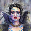
Let's start with general view. The painting is quite pleasant to the eye and it's best part is the face, undoubtedly. I also think that if you cut off everything below her collarbones, the picture would look better. There are two reasons for it: the composition would be more eye-catching and also the part below collarbones looks a bit like you wasn't entirely sure what to do with it. Try covering that part with your hand and look at it that way (: Then we have just a small part of the shoulders with mysterious blue marks that accent nicely the bottom of the painting.
About anatomy. Again, shoulders and below. Let me show 2 pictures that can help us, one at posemaniacs.com and one in our dA stocks. Pay attention how the collarbones and tendons pronounce - there is no one regular line for them as you painted below the necklase; also this place, neck and upper chest - there are many folds and curves that make lovely shadows on the skin. Look how the light behaves in that area in the linked stock photo. Of course, I mention this, because the rest of your painting follows anatomy and chiaroscuro in a way that would suggest a continuation of it lower. An area around neck and chest is not an easy thing to depict, but still I think you've dealt with it not that bad, except the mentioned cases.
Face. As I've said before, it's the strongest part of your painting, however, there is a flaw that has been bugging me since I noticed it - her irises have two diffrent sizes. Luckily it's this type of mistakes that everyone knows how to correct and it's rarely noticeable when the rest of the picture is nice. In this case, you put so much so nice elements that the attention distracts from looking at it. Except this, the face is painted exquisitely, from her skin, through make-up (planned very well) to her lines.
Hair. Let us help here with a drawing from `alicexz. The most common mistake - that most people even don't recognise as a mistake - is drawing/painting one hair after another. Because of this people forget that hair is just another mass that forms a shape and, as a shape, it has shadows and highlights as much as a face or even an apple. Take a look at hair in `alicexz's drawing - you can easily see where the light comes from and how does it behave. The highlights appear on both the enlightened and not enlightened part of hair, but on the enlightened part it's much more striking and noticeable, while it's totally calm on the darker side. Hair in your painting lacks this point and that's why they appear flat. The main correction would be to strongly darker the parts behind the crows.
Crows: looks like your favourite parts to paint are heads (: Again, this time their heads are the best depicted parts. The idea of small brush strokes to present their feathers was a good idea, but only on their heads and necks, and partly on their stomachs. Small visible strokes = small feathers. On their wings, the strokes should be analogously thicker, as wings have strong, long and thick feathers, so they could handle flying.
To sum it up, it's a very good painting and it shows how much potential you have. Keep up the good work!